Sunday, 14 August 2011

About Soft Pastels


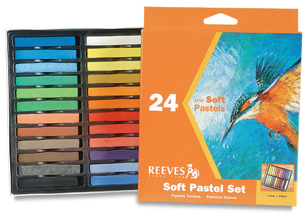
           I have been asked a few times by people about soft pastels as a painting medium. It seems that when people hear about soft pastels a few would immediately get the picture of “Crayola” or “Guitar”, two popular brands of   “crayons” we grew up with which we used in kindergarten for our colouring books. Although, soft pastel is sometimes referred to as crayons, these two types of crayons (the kindergarten and soft pastels) are not the same. Firstly, in simple terms, as defined in Wikepedia, “ a crayon is a stick of colored wax, charcoal, chalk, or other materials used for writing, coloring, drawing, and other methods of illustration.” Therefore, “crayon” is a generic term for any coloured sticks used for drawing.   The kindergarten type is a wax crayon. Oil pastels contain pigment combined with non-drying oil and wax binders.  On the other hand, soft pastels contain ground pigment combined with dry gum binders and chalk. According to Wikepedia, it is the “most widely used form of pastel. The sticks have a higher portion of pigment and less binder, resulting in brighter colors.”

             The way to use a soft pastel is much like how we use a pencil or kindergarten crayons. It is used by rubbing the sticks over an abrasive surface, leaving colour on the grain of the paper, canvas, sandboard or paper.  A few of the popular paper used are the Colorfix, and Mi-teintes, among others. I also use watercolour paper and the result is great.

             Blending soft pastel is easier than with oil pastel or any other medium. All one does is rub or smudge it with a finger. However, as pastels contain chalk as well, smudging results in a fair amount of dust. It is for this “chalky” reason also that soft pastel paintings need to be protected by framing the painting in glass. Some artists like using fixatives to aid in fixing the pastel on the paper.

            Generally, a pastel artwork is called a painting if the entire surface of the paper or canvas is covered in pastel, if it is not, then artists like to call them sketch or drawing.

Cost-wise, a 3-inch (approx.) stick of soft pastel  would  be about $4.00 to $7.00, depending on the brand. Some known brands include Sennelier, Unison, Reeves, Schmincke, and Rembrandt, to name a few. On a rough estimate, there could be a few hundred colour selections available, so collecting each of them could be come to a substantial amount. A significant savings on cost of purchase can be had by buying in sets, but the colour range is much limited, so buying individual sticks is unavoidable.  The better quality pastels cost a lot more, but it is worth investing in them because they really offer a wide range of colour selections and once applied on paper comes out brighter and more vibrant than the cheaper options.

            Soft pastel as an art medium is very popular nowadays as evidenced by the existence of  Pastel Art Societies all over the world. In art shows, there are separate categories dedicated to pastel art, along with other media such as oil, acrylic, etc. People like to collect pastel paintings because of the medium’s inherent bright colours combined with the artist’s artistry. 


Photocredits:  vanessaturner.com and dickblick.com

Saturday, 30 July 2011

Plugging

            A few of my works are currently on exhibit at the 2011 Almond Blossom Art Trail in Willunga during the Almond Blossom Festival. Check out and be a part and see works of other artists.

           Place: Willunga Uniting Church, & St. Judes
           Date: 29th of July - 31st of August

Saturday, 23 July 2011

Previous Works No. 2 - A Moment of Playfulness and Happiness

           
            This painting of  happy and laughing kids was done very early on when I was just starting to experiment with soft pastels. In the past I have  experimented a little bit with oil pastels but did not develop a liking for it because of the difficulty of blending colours and less vibrant pigments. So when I first got to use soft pastels (and realize that I don't need to wash paint brushes as I do when I use oil paints) and saw how vibrant and bright the colours can be, I was hooked. I knew soft pastels will be one of my preferred media. 

            Doing portraits is both  challenging and fun.  The key is to get  the facial  expression right, and to render and portray the subject in an artist's  own way and ( personally) the portrait not ending up looking like just another photograph  of the subject. This painting shows the general likeness of the subjects, and  the hearty smiles on their cute happy faces. Seeing this  image takes me back to my childhood back in the Philippines, when  having fun meant having a swim in the river,  climbing trees and running around as opposed to today's kids' fascination with video games and technology. Those were the days!
.
Many thanks to my good friend Eric Villaroman for letting me use one of his beautiful photographs as basis for this painting. Keep snapping great looking pictures!

Saturday, 2 July 2011

A Day Of Having Fun Cooking With Colours And Getting Addicted To Green Tea!


They say cooking is an art. Everyone knows that painting is an art! Therefore,  cooking is similar to painting. Delicious food excites our sense of taste, on the other hand a good painting is a visual delight. Both satisfy our senses in different ways.

Painting is like cooking, except that the ingredients are different. As everyone know, with cooking, the main ingredients are meat, fish, poultry, vegetables, sauces, salt and pepper, herbs and spices, etc. With painting however, the main ingredients are colour, paper, a bit of inspiration, lots of imagination, and believe or not, multiple cups of green tea!

As most of us can cook, does that mean anyone can paint too? I guess so, as long as the interest is there! For those who are interested, read through. If you are not interested, still read through. Ha! Get ready to whip up a nice fun painting. Just follow the recipe. Don’t forget your green tea, though!


Recipe for a day of fun painting:

Usual ingredients: Most of these are found in our drawers, stored and unmoved for months. The others can be bought from your nearest local art supply shops. One item is within you , so just  look hard.

Paper – a piece of anything really (tissue, scrap paper, bond paper, etc). Set aside flat on a surface or table.

Colour – a pinch of anything (watercolour, oil paint, crayons, soft pastel, etc). Apply to taste.

Pencil – the usual pencil you buy from shops maybe, but do sharpen it, no one wants to draw with a dull, unsharpened lead (no one wants to use a dull knife either for cooking,  right?)

Eraser – similar to water in cooking, used for thinning the soup if it gets too thick and   you feel you need a spade to scoop it into your mouth to get a taste. Use the eraser whenever you think the colour has gone too thick, or muddy or just plain wrong or ugly!

Apron - really a necessity so paint don’t get into your nice designer shirt. Also, wearing an apron, also make you think you are cooking, err…painting something special, so give it a go!

2 liters of imagination – Put as much as you can, but also exercise control, unless you are making an out- of –this- world art, which I doubt even exist! Just be true to your sense of beauty, you’ll be on the right track!  Pictures help fire up imagination, so don’t shy away from it, but don’t copy it!

 
Directions for painting: You don’t need oven-fire with this activity, but you do need fire in your belly! (kids don’t take this literally). And also most importantly, coffee or tea. Personally, I prefer green tea!

  1. Sit in a  nice, warm spot in your lounge room or studio.

  1. Have a sip of your hot green tea!

  1. Now, get your paper and tape it on its sides. So it doesn’t move when you start doodling.

  1. Have another sip of your hot green tea!

  1. Start doodling. Just doodle, something will come up. If you have been staring at it for 4 hours and nothing has come out yet, pull out the pictures and start from there, but then again, don’t COPY it!
 
  1. Now that you have managed to draw something, reward yourself. Have another sip of your “now cold” tea. If you like hot tea, make a short trip to the microwave oven and re-heat it. Don’t wander off into the TV room, because you’ll get tempted to watch TV, and you won’t be able to get back to painting! So don’t wander off to the TV room. You have been warned!

7. Apply colour to taste. Stand back once in a while. If you stand back, you’ll get a better look of the painting, and you will see what else you need to do. You will get a feel which areas need to be darker or which ones need highlights. It is like tasting in cooking, you have a little taste of it and right away you know whether your concoction needs a little bit more water, salt, or pepper, etc. 
8. Now, let it simmer for a while! Continue working. Much like in cooking, put your heart in it. Do it with love. Mums always say that food cooked with love tastes a lot better! Have short breaks, though. Chat with your friend, or flat mate about his day.  If you get a blank reaction from him or he looks bored talking to you, save some dignity, excuse yourself and do something else. Don’t be dense, he obviously is not interested in a meaningless chat with you. Instead, have another sip of your hot tea! 

9. Before you know it you have managed to paint a delightful picture! Stand back one last time. Have a look. Take your time. Do the final touches. Don’t forget to sign your painting! It is like announcing to your bored flat mate that you are done cooking and he can now eat your delicious food!

10. Last but not the least! PRESENTATION! PRESENTATION!. Ever wonder why your ordinary dish looks mouth-wateringly delicious on a nice, shiny plate? Well, it is because it is really delicious! Ha ha! Seriously, it would be good if you have got a nice, decent frame to hang your painting with. A painting usually look a lot better with a nice frame. 

Now that everything is finished, remind yourself how  much you enjoyed the activity. Then, finish your day with a hot tea again! Or chocolate, …or ice cream, …or a piece of cake, …or……anything!.

Monday, 27 June 2011

Father and Kids


"Father and Kids", Soft Pastels


Thoughts About Fathers

My father taught me the value of "independence" and "self-reliance"  early on
As a young schoolboy, overwhelmed by a seemingly difficult school task
I came up to him and  asked him to do  my assignment
He gently  uttered, "Do it yourself first and  I will check once you are done."

A father is  his  children's first hero
He walks with his  offsprings and guides them through life
Hoping that they will turn out better than himself,
Able to deal with what life throws at them.


Saturday, 11 June 2011

Work In Progress No.1 - Untitled - Update

           I went to an artists' group meet yesterday and was fortunate enough to come in time for a painting demonstration by a seasoned pastel artist. It is fun and very educational to see and observe from a distance  how other artists paint.  The members of the group are lovely and welcoming with new members, so that makes things  easy too. Over hot coffee and sweets during the break, I got to chat with some lovely people I already knew from past workshops. And oh, by the way, did I mention about the raffle ticket  I bought? The price at stake is a beautiful painting by Trevor Newman. Gee, I hope I win!

           Going back to the painting, I spent some more time working on this  and now it is almost 90% complete! Still have to work on the dog, especially. At the moment, it is just a blob  of white pastel shaped like a dog! The sea in the background works just fine. The reflection in the sand looks alright, but probably needs a little more work cleaning it up. The little girl is all done up  and am happy with the result. Really, all this painting need is a bit more  fine tuning. 

          Overall, I like this painting style, it gives the painting a distinctive  dream-like character. Although, not much attention is given to details, the richness of colour lends a different quality to it. The vibrant colours seem to jump out of the page and into the viewer's eyes. Maybe, the bright colours just give it more intensity.

Friday, 3 June 2011

Work in Progress No.1 - Untitled


Adelaide winter has just officially began. The past few days have been rainy and cold and it feels good to  stay home and enjoy  a steaming cup of tea while reading a good book. Unwittingly, I think I have developed a mild case of  addiction  to Nutella over the last few days as a result of  not having a lot to do besides eating (darn!). In between spoonfuls of Nutella,  I managed to sit down and spend a few moments working on this painting. Actually, am enjoying this one because this is typically not how I would do a painting ( I like the more detailed look ). Thus, I find this one a  bit  of a challenge. Typically, I  apply colours thickly and quickly and rub/blend often to get a more softer look. With this one however, I tend to apply colours lightly, sparingly and in layers  and without a lot of blending or rubbing. That is why one can still see a lot of the texture of the base paper.  Personally, I find this method/approach a lot  slower and more disciplined. Anyway, still some more painting sessions left  on this before it's finished! Let's see how it goes!  Happy weekend everyone!